 Fredrin
SaaS
Fintech API Landing (Light)
A calm, precise launch page for a developer-first money platform.
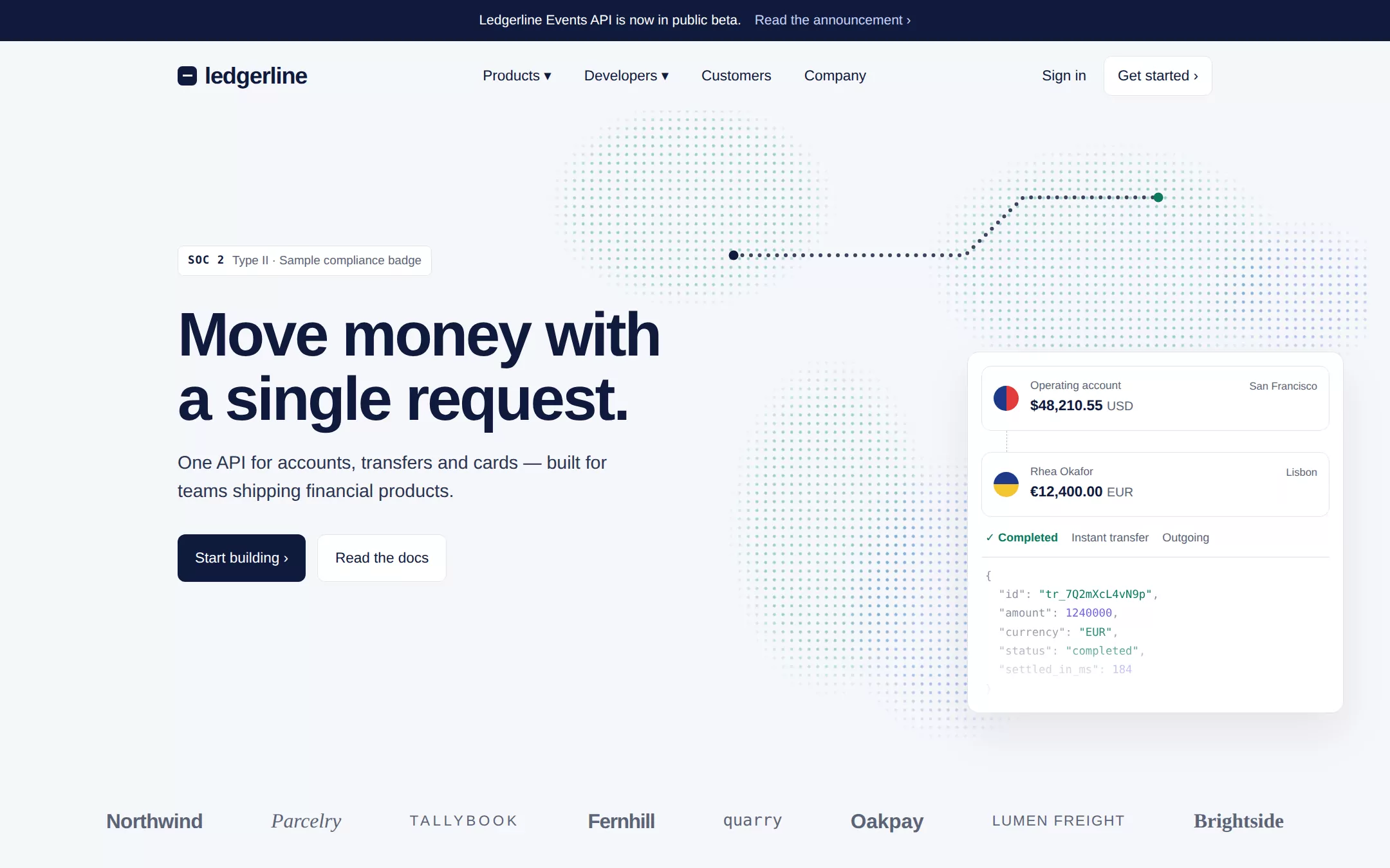
A pale, quiet product page where precision does the selling: a halftone dot field drifts behind a navy two-line promise, a floating transfer card shows a completed payment above its JSON payload, and a dotted path traces the money between two points. Below, a wordmark strip, four accent-green metrics, a customer-story panel over a warm dot gradient and a live-looking code sample make the case to both the finance lead and the engineer.
- Best for
- A payments, banking-infrastructure or other developer-API startup that has to look trustworthy to a CFO and useful to an engineer on the same screen.
- Tech stack
- - Next.js (App Router) - React Server Components - TypeScript - Plain CSS with custom properties - CSS radial-gradient dot fields and inline SVG for all artwork
- Tags
- fintech · API · developer · halftone · light · navy · SaaS · infrastructure
The creation prompt
1335 words, self-contained. Paste it into a chat session with your coding agent and it builds Fintech API Landing (Light) end to end.
Build the "Fintech API Landing (Light)" kickstart — A calm, precise launch page for a developer-first money platform.

## Design
Use https://column.com/ as the visual reference: an airy, near-white canvas, restrained navy type, and halftone dot fields as the only illustration. Reinterpret it for a fictional platform without copying its brand, copy, customer logos, figures or map. The hero dot field is a CSS radial-gradient grid of 3px dots on a 9px pitch, masked by three or four soft radial blobs so it reads as abstract landmasses fading to the page colour, tinted from pale teal to pale blue. Over it, a single dotted SVG path with two solid endpoints traces a transfer across the field. Everything else is flat: white cards with a 1px border and one soft, wide, low-opacity shadow, generous whitespace, and a 1120px content column with 24px gutters. The customer-story panel swaps the cool dots for a warm peach-to-coral dot gradient in its right half. No photography, no 3D, no glow, no gradients on text.

### Colour palette (use these exact values)
- Background: #F6F7FA
- Surface / cards: #FFFFFF
- Primary text: #0F1A3D
- Secondary text: #5B6477
- Accent (buttons, links, active state): #0B7A62
- Text on accent: #FFFFFF
- Borders / dividers: #E1E4EC
Use exactly one accent. Everything that needs emphasis earns it through weight, scale or space instead of a second colour.

### Typography
- Headings: Inter, 'Helvetica Neue', Helvetica, Arial, system-ui, sans-serif
- Body: Inter, 'Helvetica Neue', Helvetica, Arial, system-ui, sans-serif
- One neo-grotesque, tight at the top and relaxed below. The h1 runs clamp(40px, 5.2vw, 64px) at weight 650, -0.035em tracking and 1.04 line-height, left-aligned in two lines. Section headings are 30px at weight 600 with their second clause set in the muted colour. Body is 17px/1.6. Kickers, JSON and code use ui-monospace at 12–13px with 0.08em tracking for kickers. Metric figures are 28px at weight 500 in the accent.

### Page structure
1. Announcement bar: a full-width ink strip with one short centred line and a text link with a chevron
2. Header: a lowercase wordmark on the left, four nav items (Products, Developers, Customers, Company) centred, and Sign in plus a bordered Get started button on the right
3. Hero: a small bordered compliance-style badge, a two-line headline, a two-line lead, a solid ink Start building button and a bordered Read the docs button on the left; on the right, a floating transfer card showing two accounts with amounts and currencies, a status row (Completed · Instant transfer · Outgoing) and a faded monospace JSON payload, over the dot field and its dotted transfer path
4. Wordmark strip: eight fictional customer names set as type in varied weights and faces, evenly spaced on one line, greyed to the muted colour
5. Scale: a monospace kicker pill, a two-tone heading, a short paragraph and a bordered Learn more button beside a column chart of thin vertical dotted bars rising left to right, each capped with an accent dot; then a four-up row of metrics in the accent with muted captions
6. Customer story: a large white panel with a tab row of four fictional customer names (the active one filled), a heading naming how that customer uses the platform, three bordered product pills, and a quote with its author, over the warm dot gradient on the right
7. Developers: a two-column split with a short heading and three checkmarked capabilities on the left, and a dark ink code card on the right showing a curl request and its JSON response with syntax colouring
8. Closing call to action and footer: a centred heading and one Start building button, then a four-column link footer with the wordmark, a legal line and a small print disclosure

### Components and detailing
The primary button is solid ink (#0F1A3D) with white 15px weight-500 text, 8px radius, 12px/18px padding and a trailing chevron that nudges 2px right on hover. Secondary buttons are white with a 1px border and ink text. The accent never fills a large area: it is the metric figures, links, the Completed status, the chart's dots, checkmarks and the focus ring. Cards are white, 12px radius, 1px border and a 0 20px 50px rgba(15,26,61,0.08) shadow. Pills and badges are 6px radius with a 1px border and 12–13px text. The transfer card uses small circular CSS-drawn flag-like discs (two-colour split circles, not real flags). The code card is ink with 13px monospace, the accent for strings and a pale violet (#B7B3FF) for numbers and keywords. Every dot field and the transfer path are aria-hidden. Focus rings are a 2px accent outline at 2px offset.

### Motion
Quiet and exact. The dotted transfer path draws itself once on load with a stroke-dashoffset animation over 1.4s, then its endpoint dot pulses softly every 3s. The transfer card fades up 12px on load after a 0.2s delay. The chart bars grow from zero height with a 40ms stagger when the Scale section enters the viewport, via one IntersectionObserver, and the customer tabs cross-fade their panel in 200ms. Under prefers-reduced-motion everything renders in its final state with no animation.

## Tech stack
- Next.js (App Router)
- React Server Components
- TypeScript
- Plain CSS with custom properties
- CSS radial-gradient dot fields and inline SVG for all artwork
Where the repo you are working in already has an equivalent in place, keep the repo's choice and say which one you kept.

## Everything else
Build a product landing page for a developer-first fintech API on the latest Next.js (App Router). Use the sample brand Ledgerline, with the announcement “Ledgerline Events API is now in public beta.”, the headline “Move money with a single request.” and the lead “One API for accounts, transfers and cards — built for teams shipping financial products.” The hero card shows a transfer from “Operating account · $48,210.55 USD” to “Rhea Okafor · €12,400.00 EUR” with the status row Completed · Instant transfer · Outgoing and a short matching JSON payload. Seed eight clearly fictional customer names for the wordmark strip (for example Northwind, Parcelry, Tallybook, Fernhill, Quarry, Oakpay, Lumen Freight, Brightside). The Scale section says “Settling billions every month for teams that can’t afford a bad day.” with four metrics: “$38B+ annual volume”, “99.99% API uptime”, “< 200 ms median transfer” and “40+ currencies supported”. The customer story has four tabs of fictional customers, each with its own heading, three product pills and a short quote with a name and role; the tabs are a real tablist with arrow-key navigation, and only the active panel is exposed. The Developers section lists Idempotent requests, Signed webhooks and Sandbox with test money, beside a code card showing POST /v1/transfers with a JSON response; the card has a Copy button that copies the curl command and announces “Copied”. Keep the brand, nav, copy, metrics, customers and code sample in one typed site config so the owner can rebrand in one file. Buttons link to in-page anchors or #; there are no accounts, forms, payments or backend. Label all figures and customers as sample content in the footer's small print. Include a short README explaining how to change the brand, copy, palette, metrics and dot-field shapes. The finished page runs locally with no API keys, no database and no external assets.

### Non-negotiables
- Responsive from 360px through desktop — no horizontal scrolling at any width.
- Every text/background pair clears WCAG AA (4.5:1 for body, 3:1 for large text); adjust a tint rather than shipping a failing pair.
- Fully keyboard operable, with a visible focus ring drawn in the accent colour.
- Honour `prefers-reduced-motion` — swap every transition for an instant state change.
- Write real copy in the voice described above; no lorem ipsum and no TODO placeholders.
- Use system or self-hosted fonts and CSS/SVG-drawn graphics — do not depend on a remote image or icon service.

Build the whole page end to end and show me the result running — not a description of it.
Pasting the prompt is step one. Fredrin runs the agent that builds it, one ticket per look.