 Fredrin
Portfolio
Chuck Norris
A cut-and-paste collage of painted sky, torn paper and typewriter copy.
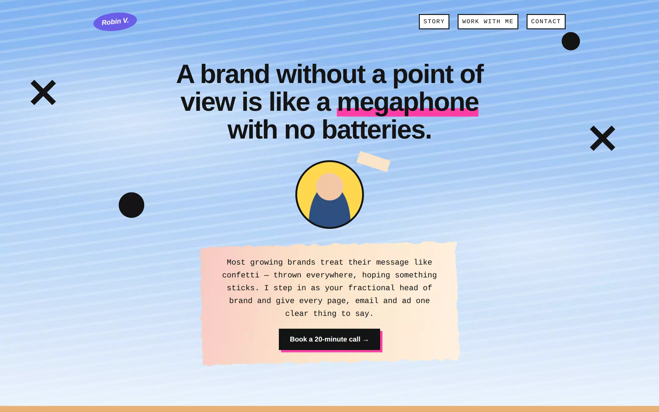
A scrapbook of a page: a painted-sky hero with black X and dot stickers, the pitch typed onto a torn paint swatch, a story card with a hot-pink offset shadow over a sunset landscape, and offer cards pinned with teal and pink shadows. Loud and handmade, yet every line of text sits on solid paper so it still reads.
- Best for
- A consultant, freelancer or fractional lead who sells on voice and wants a page as loud and handmade as their pitch.
- Tech stack
- - Next.js (App Router) - React Server Components - TypeScript - Plain CSS with custom properties - Inline SVG filters and CSS gradients for all artwork
- Tags
- collage · zine · typewriter · playful · about me
The creation prompt
1100 words, self-contained. Paste it into a chat session with your coding agent and it builds Chuck Norris end to end.
Build the "Chuck Norris" kickstart — A cut-and-paste collage of painted sky, torn paper and typewriter copy.

## Design
Use https://teardwn.com/ as the visual reference: a cut-and-paste zine collage where every section has its own painted backdrop and text is pasted on top. Reinterpret it without copying its brand, copy, photographs or logos — all artwork is CSS gradients and inline SVG. The hero is a streaky painted sky (a vertical sky-blue gradient with soft white cloud blooms and faint diagonal brush streaks), scattered with large black ✕ marks and solid black dots in the side gutters. Text never sits directly on a busy backdrop: it is always on a torn paint swatch, a speech bubble or a paper card. Torn swatches are a pink-to-cream gradient with ragged edges made by an SVG feTurbulence + feDisplacementMap filter applied ONLY to a pseudo-element behind the text, never to the text itself, and tilted about 1°. Cards are flat paper with a hard, unblurred offset shadow (10–14px) in the accent pink or the teal #12E2B0. The story section sits on a warm sunset gradient with two dark green hill shapes; the proof section returns to the pale sky; the footer is solid ink.

### Colour palette (use these exact values)
- Background: #EAF2FB
- Surface / cards: #FFFDF7
- Primary text: #141414
- Secondary text: #4A4A4A
- Accent (buttons, links, active state): #FF3EA5
- Text on accent: #141414
- Borders / dividers: #141414
Use exactly one accent. Everything that needs emphasis earns it through weight, scale or space instead of a second colour.

### Typography
- Headings: 'Helvetica Neue', Helvetica, Arial, system-ui, sans-serif
- Body: 'Courier New', Courier, ui-monospace, monospace
- A tight grotesque for headings against a typewriter body — the contrast is the look. The h1 runs clamp(34px, 5vw, 58px) at weight 800 with -0.03em tracking and 1.05 line-height, centered. Body is 17px/1.65 monospace, never below 16px, at most ~62ch wide. Nav labels are 13px uppercase at 0.12em tracking.

### Page structure
1. Header: a tilted violet oval name badge on the left; uppercase nav links as small white boxes with a 2px ink border on the right (Story, Work with me, Contact)
2. Hero: a centered one-sentence claim with one word highlighted by a thick accent underline bar, a circular CSS-drawn portrait placeholder with a strip of masking tape, then a torn paint swatch holding a short typewriter paragraph and the primary call-to-action
3. Story: a torn-swatch section label, a speech bubble teeing up a short anecdote, and a two-column paper card of first-person story with a pink offset shadow, over the sunset-and-hills backdrop
4. Proof and offer: a torn-swatch label, a row of past-client names set as type in varied faces (no logos), then two offer cards — one-off and ongoing — each with a small uppercase term, a title, a sentence or short list, and one button
5. Contact: an ink footer with an availability line, the email address as the largest link on the page with an accent underline, and a muted city/reply-time line

### Components and detailing
Buttons are a solid ink rectangle with white 15px bold grotesque text, 16px/24px padding and a 5px accent offset shadow; hover lifts 2px and grows the shadow to 7px, active presses 3px down and shrinks it to 2px. The accent is only ever a shadow, an underline bar or a highlight — never a second button colour. Offer cards are white with a 2px ink border and a 10px offset shadow, alternating teal and pink. The speech bubble is white with a 3px warm border, 40px radius and a CSS triangle tail. ✕ and dot stickers are aria-hidden and hidden below 640px so nothing overlaps text on phones. Focus rings are a 3px accent outline at 3px offset.

### Motion
Only the button lift/press and link colour at 150ms. The collage is static — no parallax, floating stickers or scroll reveals. Under prefers-reduced-motion every transition is instant.

## Tech stack
- Next.js (App Router)
- React Server Components
- TypeScript
- Plain CSS with custom properties
- Inline SVG filters and CSS gradients for all artwork
Where the repo you are working in already has an equivalent in place, keep the repo's choice and say which one you kept.

## Everything else
Build a personal “about me” one-pager on the latest Next.js (App Router), for a solo consultant, using generic placeholder content the owner will replace. Use the sample persona Robin Vale, a fractional head of brand in Lisbon, with the headline “A brand without a point of view is like a megaphone with no batteries.” (highlight “megaphone”) and a hero paragraph explaining that growing brands scatter their message and Robin gives every page, email and ad one clear thing to say, ending in a “Book a 20-minute call” button that jumps to the contact section. The story section tells one short, specific anecdote with a measurable result (for example a bakery whose one-line rewrite — “Out of the oven at 6:40. Gone by 9.” — started a weekend queue), in five short first-person paragraphs. The proof section lists four fictional past-client names set as type, then two offers: “The Teardown” (one-off, two weeks, an audit of site, emails and ads) and “Fractional Head of Brand” (ongoing, one day a week, with three bullet points). The footer gives an availability line, the email [email protected] as a mailto link, and “Lisbon · replies within a day”. Keep the name, headline, paragraphs, client names, offers and email in one typed site config so the owner can replace every word in one file. Nav links are in-page anchors. Draw the portrait placeholder, stickers, swatches, sky and hills in CSS/SVG — no image files, no remote fonts. Include a short README explaining how to swap the persona, copy and palette. The finished page runs locally with no API keys, database or external assets.

### Non-negotiables
- Responsive from 360px through desktop — no horizontal scrolling at any width.
- Every text/background pair clears WCAG AA (4.5:1 for body, 3:1 for large text); adjust a tint rather than shipping a failing pair.
- Fully keyboard operable, with a visible focus ring drawn in the accent colour.
- Honour `prefers-reduced-motion` — swap every transition for an instant state change.
- Write real copy in the voice described above; no lorem ipsum and no TODO placeholders.
- Use system or self-hosted fonts and CSS/SVG-drawn graphics — do not depend on a remote image or icon service.

Build the whole page end to end and show me the result running — not a description of it.
Pasting the prompt is step one. Fredrin runs the agent that builds it, one ticket per look.