 Fredrin
Portfolio
Developer Portfolio (Dark)
A dark terminal that happens to be a personal page..
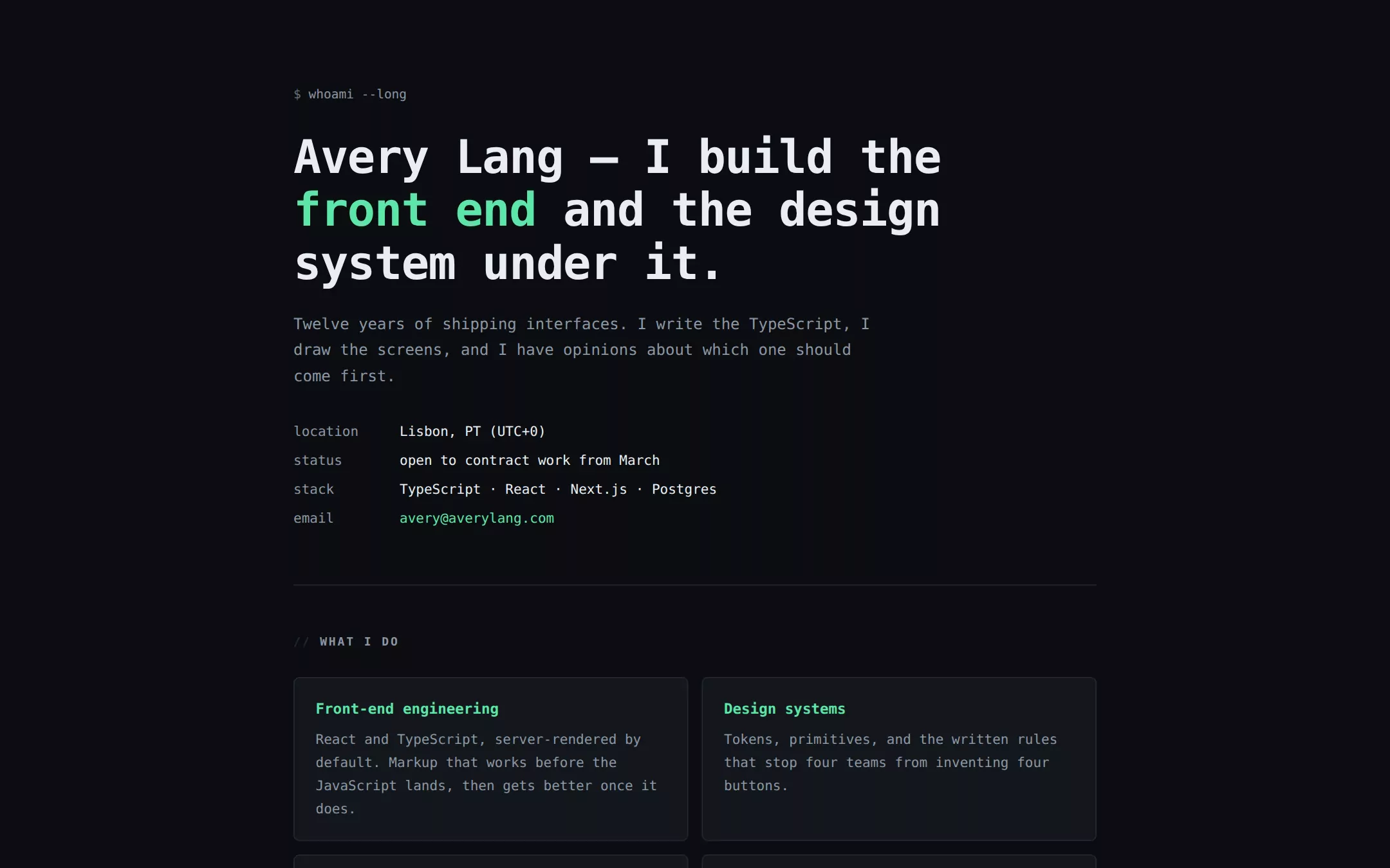
Near-black, monospaced from the h1 down, with one mint accent doing every job a colour can do. The header opens on a shell prompt, facts are laid out as an aligned key/value block, and work is a stack of bordered panels tagged with the role. It looks like a terminal because its reader spends the day in one.
- Best for
- An engineer or technical founder whose audience reads code all day and trusts a page that looks like the tools they already live in.
- Tech stack
- - Next.js (App Router) - React Server Components - TypeScript - Plain CSS with custom properties - CSS-drawn panels and rules, no icon library
- Tags
- dark · monospace · terminal · developer · about me
The creation prompt
812 words, self-contained. Paste it into a chat session with your coding agent and it builds Developer Portfolio (Dark) end to end.
Build the "Developer Portfolio (Dark)" kickstart — A dark terminal that happens to be a personal page..

## Design
A well-configured terminal, not a hacker aesthetic. The background is a true near-black with a barely-lifted panel tone above it, and the borders are dark enough that the panels read as grouping rather than as boxes. One mint accent carries links, the prompt glyph, panel headings and the single button — and it is the only colour on the page, so it always means “this matters”. Section headings are prefixed with a comment marker. No glow, no scanlines, no fake CRT curvature: the restraint is what makes it read as professional rather than as a costume.

### Colour palette (use these exact values)
- Background: #0B0D10
- Surface / cards: #13171C
- Primary text: #E8EDF2
- Secondary text: #8B97A5
- Accent (buttons, links, active state): #5CE6A8
- Text on accent: #06110C
- Borders / dividers: #242C35
Use exactly one accent. Everything that needs emphasis earns it through weight, scale or space instead of a second colour.

### Typography
- Headings: ui-monospace, 'SF Mono', SFMono-Regular, Menlo, Consolas, 'Liberation Mono', monospace
- Body: ui-monospace, 'SF Mono', SFMono-Regular, Menlo, Consolas, 'Liberation Mono', monospace
- Monospace everywhere — there is no second family. The h1 runs clamp(30px, 5.6vw, 48px) at weight 600 and -0.02em tracking; body sits at 15px/1.7, small enough that the fixed advance width still reads as text rather than as a table.

### Page structure
1. Header: a shell-prompt command line, the h1 with one clause set in the accent, a short lead paragraph, and an aligned key/value block of location, status, stack and email
2. What I do: four bordered panels in a two-column grid, each with an accent subhead and two sentences
3. Selected work: three bordered panels, each with the project name, a filled accent role tag, one paragraph, and a row of small outlined stack chips
4. About: three paragraphs of plain first-person prose at full width, no panel around them
5. Contact: a one-sentence availability line, the email as a filled accent button, and a muted fine-print row

### Components and detailing
Panels are 1px border on the surface tone at 6px radius with 20px/22px padding. The role tag is a filled accent rectangle at 3px radius with 11px uppercase text in the accent-ink tone. Stack chips are 1px border, 3px radius, 11px muted text. The one button is filled accent at 5px radius, weight 600. Links are accent with a 4px-offset underline on hover only. Section headings carry a `//` prefix in the border tone. Hairlines separate top-level sections.

### Motion
Restrained to state changes: link underline and button opacity at 150ms, nothing else. No typing animation, no blinking cursor, no terminal “boot” sequence — those read as a gimmick on second visit and they cost the reader time before the content appears. Reduced motion removes even the transitions.

## Tech stack
- Next.js (App Router)
- React Server Components
- TypeScript
- Plain CSS with custom properties
- CSS-drawn panels and rules, no icon library
Where the repo you are working in already has an equivalent in place, keep the repo's choice and say which one you kept.

## Everything else
Build a personal “about me” one-pager on the latest Next.js (App Router).
Near-black, monospaced from the h1 down, with one mint accent doing every job a colour can do. The header opens on a shell prompt, facts are laid out as an aligned key/value block, and work is a stack of bordered panels tagged with the role. It looks like a terminal because its reader spends the day in one.
Best for: An engineer or technical founder whose audience reads code all day and trusts a page that looks like the tools they already live in.

### Copy and imagery
Direct and unembellished, the register of a good README. Facts before prose: the key/value block answers where, when and with what before the paragraphs start. Project copy names the measurement — a latency number, a ticket-volume change, a shipping window. The about section explains a working preference rather than listing employers. No photography, no logos, no illustration.

### Non-negotiables
- Responsive from 360px through desktop — no horizontal scrolling at any width.
- Every text/background pair clears WCAG AA (4.5:1 for body, 3:1 for large text); adjust a tint rather than shipping a failing pair.
- Fully keyboard operable, with a visible focus ring drawn in the accent colour.
- Honour `prefers-reduced-motion` — swap every transition for an instant state change.
- Write real copy in the voice described above; no lorem ipsum and no TODO placeholders.
- Use system or self-hosted fonts and CSS/SVG-drawn graphics — do not depend on a remote image or icon service.

Build the whole page end to end and show me the result running — not a description of it.
Pasting the prompt is step one. Fredrin runs the agent that builds it, one ticket per look.