 Fredrin
Portfolio
Creative Portfolio (Dark)
Two colours, enormous type, and nothing else..
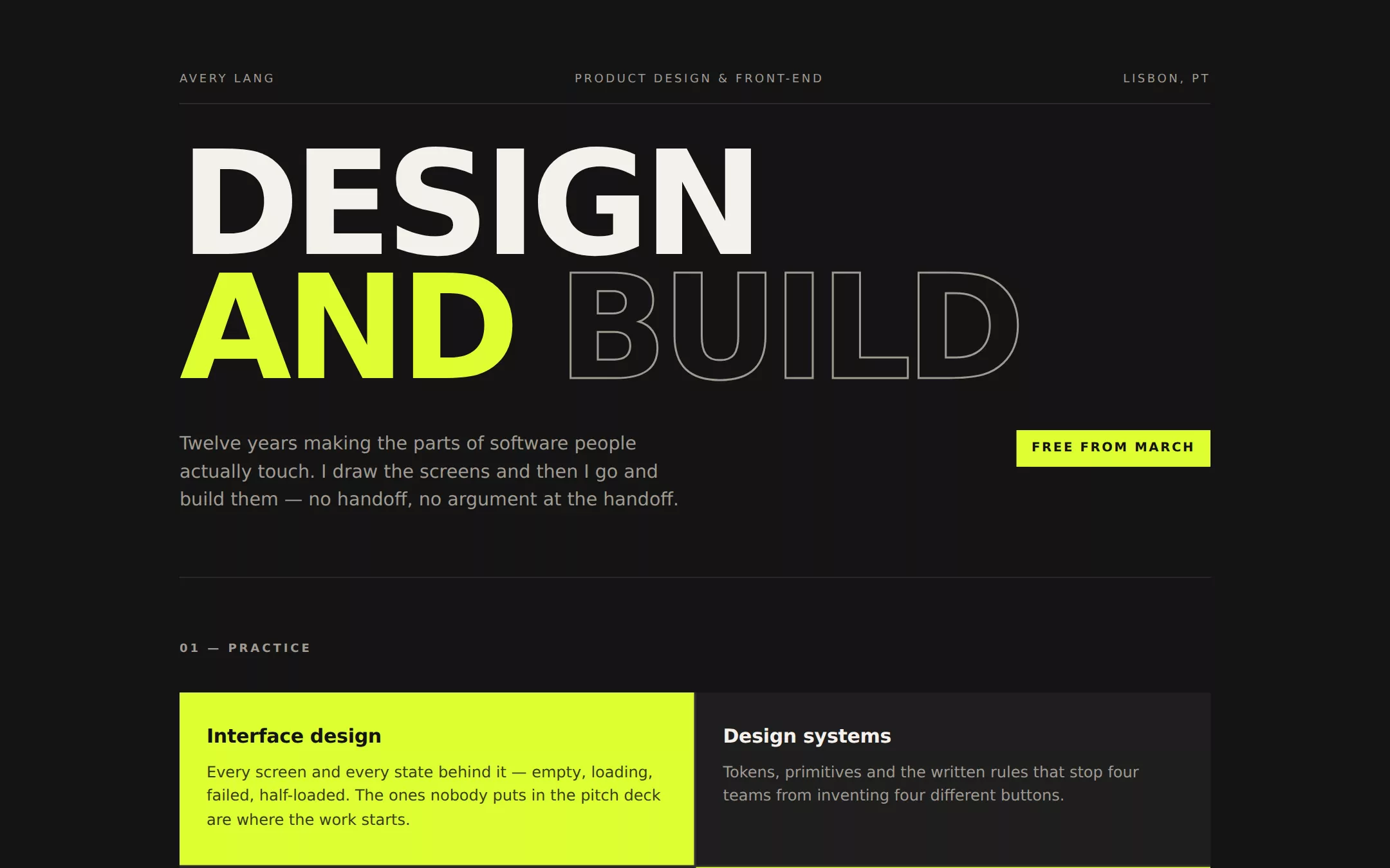
Ink and one acid accent, with a headline big enough to read from across the room. The hero sets a word in the accent and outlines the next in stroke only; the practice grid lights two of its four cells; project names run at poster scale. It is the loudest page here and still only uses two colours.
- Best for
- Someone who wants to be remembered from a link preview — an art director, a design engineer, or anyone whose work should feel loud before it is read.
- Tech stack
- - Next.js (App Router) - React Server Components - TypeScript - Plain CSS with custom properties - CSS text-stroke for the outlined display word
- Tags
- graphic · high contrast · bold · poster · about me
The creation prompt
861 words, self-contained. Paste it into a chat session with your coding agent and it builds Creative Portfolio (Dark) end to end.
Build the "Creative Portfolio (Dark)" kickstart — Two colours, enormous type, and nothing else..

## Design
A screen-printed poster. Two colours and nothing else: a deep neutral ink and one acid accent that is either the whole background of a block or the whole fill of a word — it is never a tint, a border, or a small dot. The hero is a type composition, not a headline over a paragraph: one word solid, one word in the accent, one word drawn in outline stroke only. Scale carries all the hierarchy, so the page has exactly two type sizes that matter and everything else is small uppercase labelling. No gradients, no shadows, no rounded corners, no imagery.

### Colour palette (use these exact values)
- Background: #141414
- Surface / cards: #1E1E1E
- Primary text: #F4F1EC
- Secondary text: #A09A90
- Accent (buttons, links, active state): #DDFF33
- Text on accent: #141414
- Borders / dividers: #333130
Use exactly one accent. Everything that needs emphasis earns it through weight, scale or space instead of a second colour.

### Typography
- Headings: 'Helvetica Neue', Helvetica, Arial, system-ui, -apple-system, sans-serif
- Body: 'Helvetica Neue', Helvetica, Arial, system-ui, -apple-system, sans-serif
- One grotesque at two extremes. The h1 runs clamp(52px, 13vw, 150px) at weight 800 with -0.045em tracking, uppercase, on a 0.86 line-height so the lines lock together as a block; body sits at 17px/1.55. Nothing lives in between except the 12px 0.2em uppercase labels.

### Page structure
1. Header: a three-part uppercase kicker rule (name, discipline, city), then a two-line poster headline mixing solid, accent and outlined words, with a short lead paragraph and a filled accent availability tag
2. Practice: a four-cell grid split by 2px hairlines, with two cells inverted to solid accent and two on the surface tone
3. Selected work: three hairline-separated rows, each with the project name set at poster scale in uppercase and a right-aligned accent role label above one paragraph
4. About: a two-column split — a large pull quote at 22-32px on the left, three paragraphs of muted body copy on the right
5. Say hello: the email address set as the largest link on the page in the accent, over an uppercase fine-print row

### Components and detailing
There are no cards and no radii — every block is a hard rectangle. The practice grid is a CSS grid with a 2px gap over the border colour, so the hairlines are the gap itself. An inverted cell swaps to accent background with accent-ink text at 82% opacity for its body copy. The availability tag and any button are solid accent rectangles with 700-weight uppercase text at 0.14em tracking. The outlined hero word uses a 2px text stroke in the muted tone with a transparent fill. Links underline at 2px thickness with a 6px offset on hover.

### Motion
None beyond hover. A poster does not animate; the impact is in the composition and any movement dilutes it. Link underlines and the button appear on hover at 150ms, and reduced motion removes them.

## Tech stack
- Next.js (App Router)
- React Server Components
- TypeScript
- Plain CSS with custom properties
- CSS text-stroke for the outlined display word
Where the repo you are working in already has an equivalent in place, keep the repo's choice and say which one you kept.

## Everything else
Build a personal “about me” one-pager on the latest Next.js (App Router).
Ink and one acid accent, with a headline big enough to read from across the room. The hero sets a word in the accent and outlines the next in stroke only; the practice grid lights two of its four cells; project names run at poster scale. It is the loudest page here and still only uses two colours.
Best for: Someone who wants to be remembered from a link preview — an art director, a design engineer, or anyone whose work should feel loud before it is read.

### Copy and imagery
Short, declarative sentences with no hedging — the type size means every word is read, so there is no room for filler. The headline is two or three words, not a sentence. Project paragraphs are at most three lines and lead with the outcome. The pull quote in the about section is the one place the voice slows down. No photography, no logos, no icons — the accent and the type are the whole identity.

### Non-negotiables
- Responsive from 360px through desktop — no horizontal scrolling at any width.
- Every text/background pair clears WCAG AA (4.5:1 for body, 3:1 for large text); adjust a tint rather than shipping a failing pair.
- Fully keyboard operable, with a visible focus ring drawn in the accent colour.
- Honour `prefers-reduced-motion` — swap every transition for an instant state change.
- Write real copy in the voice described above; no lorem ipsum and no TODO placeholders.
- Use system or self-hosted fonts and CSS/SVG-drawn graphics — do not depend on a remote image or icon service.

Build the whole page end to end and show me the result running — not a description of it.
Pasting the prompt is step one. Fredrin runs the agent that builds it, one ticket per look.