 Fredrin
Directory
Directory Listing (Dark)
A curated directory built for finding your next useful thing..
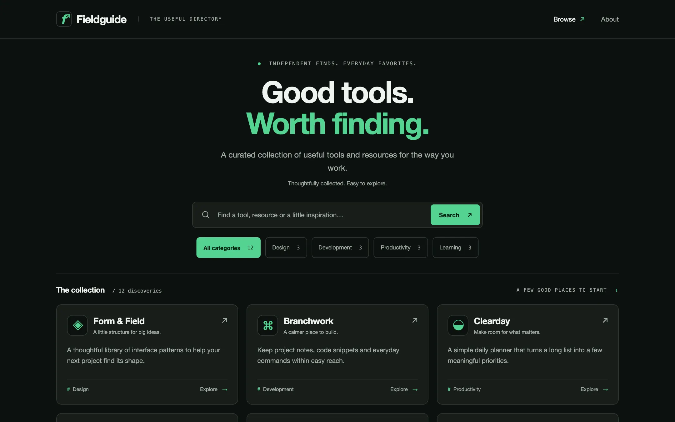
A dark, green-accented directory with a generous introduction and a dense grid of useful discoveries. Search and category filters lead to individual listing pages with descriptions, key facts, related entries and a website link. The brand, categories and listings live in editable local data, ready to become a tools, resources or services directory.
- Best for
- Curators collecting tools, resources or services into a focused directory people can browse and search.
- Tech stack
- - Next.js (App Router) - React Server Components - TypeScript - Plain CSS with custom properties - Local typed data, no database or external API
- Tags
- directory · listings · search · categories · dark · curated
The creation prompt
1059 words, self-contained. Paste it into a chat session with your coding agent and it builds Directory Listing (Dark) end to end.
Build the "Directory Listing (Dark)" kickstart — A curated directory built for finding your next useful thing..

## Design
Use https://www.opensourcealternatives.to/ as the visual and structural reference: a near-black green canvas, large centered introduction, restrained green accent, compact cards with small identity marks, concise descriptions and category tags. Reinterpret that browsing rhythm for a generic directory, without copying its brand, text, logos or open-source-specific metrics. Center a 1200px content column with 24px side gutters. Keep the header lean, the hero around 300px tall, and the search and first listing row visible in the initial desktop viewport. Give listings more space than decorative marketing sections. Use only the seven palette roles below; no stock photos, glow, gradients or ornamental illustration.

### Colour palette (use these exact values)
- Background: #0C100E
- Surface / cards: #171D19
- Primary text: #F0F4F1
- Secondary text: #A2ADA5
- Accent (buttons, links, active state): #53D391
- Text on accent: #092016
- Borders / dividers: #303B33
Use exactly one accent. Everything that needs emphasis earns it through weight, scale or space instead of a second colour.

### Typography
- Headings: 'Helvetica Neue', Helvetica, Arial, system-ui, sans-serif
- Body: 'Helvetica Neue', Helvetica, Arial, system-ui, sans-serif
- A clean sans throughout, with ui-monospace for the tiny directory label and result counts. The centered h1 runs clamp(36px, 5vw, 64px), weight 650, -0.04em tracking and 1.05 line-height. Body is 16px/1.6, listing titles 19px/1.3 at weight 600, metadata 12px.

### Page structure
1. Header: a compact local SVG mark and editable directory name on the left, with Browse and About anchor links on the right
2. Introduction: a small curated-directory label, a centered two-line heading, and one short sentence explaining what the collection helps visitors find
3. Browse toolbar: a labeled search input, an All categories option and category filter buttons with counts; below them show the matching result count and a clear-filters action when active
4. Listings: a three-column desktop grid, two columns on tablet and one on mobile; each card links to its detail page and shows a local identity mark, name, one-line tagline, short description and category label
5. Listing detail: a breadcrumb back to the directory, identity mark, name, category, summary, longer description, key facts, one Visit website action and up to three related entries from the same category
6. About and footer: a short editorial note describing the collection, a clearly labeled sample-data notice, and a quiet footer repeating the directory name

### Components and detailing
Cards use the surface tone, a 1px border, 12px radius and 22px padding, with no shadow; a hover or keyboard focus changes the border to the accent. Card identity marks are 44px local SVGs or letter monograms in neutral or accent tones. The search field is at least 48px tall and no wider than 620px; filter buttons wrap and use aria-pressed, with the selected one filled in accent and accent-ink text. Inputs and buttons have visible accent focus outlines and at least 44px touch targets. Keep descriptions aligned with a consistent card grid. A card has one internal link and no nested buttons. Detail pages use a wide prose column and a narrow facts panel, stacked on phones. The primary external link is separate from the card link and uses rel=noopener noreferrer if opening a new tab.

### Motion
Only border, text and background color transitions at 150ms. Results update without entrance animations or moving focus. Announce the updated result count politely. No parallax, auto-scrolling, staggered reveals or animated counters; reduced motion makes state changes instant.

## Tech stack
- Next.js (App Router)
- React Server Components
- TypeScript
- Plain CSS with custom properties
- Local typed data, no database or external API
Where the repo you are working in already has an equivalent in place, keep the repo's choice and say which one you kept.

## Everything else
Build a rebrandable directory with search, category filters and individual listing pages. Use the sample brand Fieldguide and the headline “Good tools. Worth finding.”, with the lead “A curated collection of useful tools and resources for the way you work.” Keep the name, tagline, description and navigation in one editable site config, and categories and entries in typed local data. Seed twelve clearly fictional but fully written sample entries across Design, Development, Productivity and Learning; label them as demo content. Each entry has a stable unique slug, name, tagline, summary, long description, category slug, searchable tags, key facts, a local identity mark and an optional website URL. Search case-insensitively across name, tagline, summary and tags, trimming surrounding whitespace. Combine search AND the selected category, preserve q and category in URL query parameters for refresh, sharing and browser back, and keep form state synchronized with that URL. The initial directory and filtered results must be server-rendered; a GET search form is a suitable baseline. Unknown categories fall back to All categories. Empty results keep the query visible and offer Clear filters. Derive counts from the data rather than inventing popularity or review numbers. Every card opens /listings/[slug], direct detail links work on refresh, unknown slugs return a proper 404, and Back to directory preserves the current filters. Add per-entry page titles and descriptions. Related entries exclude the current entry and disappear when there are no matches. Visit website appears only for entries with a valid http or https URL; fictional entries have no fabricated live destinations. Do not add submissions, authentication, accounts, voting, payments, a newsletter form, a CMS or a backend. Include a short README explaining how to change the brand, palette, categories, entries and optional website links. The finished site runs locally without API keys, external assets or a database.

### Non-negotiables
- Responsive from 360px through desktop — no horizontal scrolling at any width.
- Every text/background pair clears WCAG AA (4.5:1 for body, 3:1 for large text); adjust a tint rather than shipping a failing pair.
- Fully keyboard operable, with a visible focus ring drawn in the accent colour.
- Honour `prefers-reduced-motion` — swap every transition for an instant state change.
- Write real copy in the voice described above; no lorem ipsum and no TODO placeholders.
- Use system or self-hosted fonts and CSS/SVG-drawn graphics — do not depend on a remote image or icon service.

Build the whole page end to end and show me the result running — not a description of it.
Pasting the prompt is step one. Fredrin runs the agent that builds it, one ticket per look.