 Fredrin
Portfolio
Personal Resume (Light)
A printed contributor page, set in serif on warm paper..
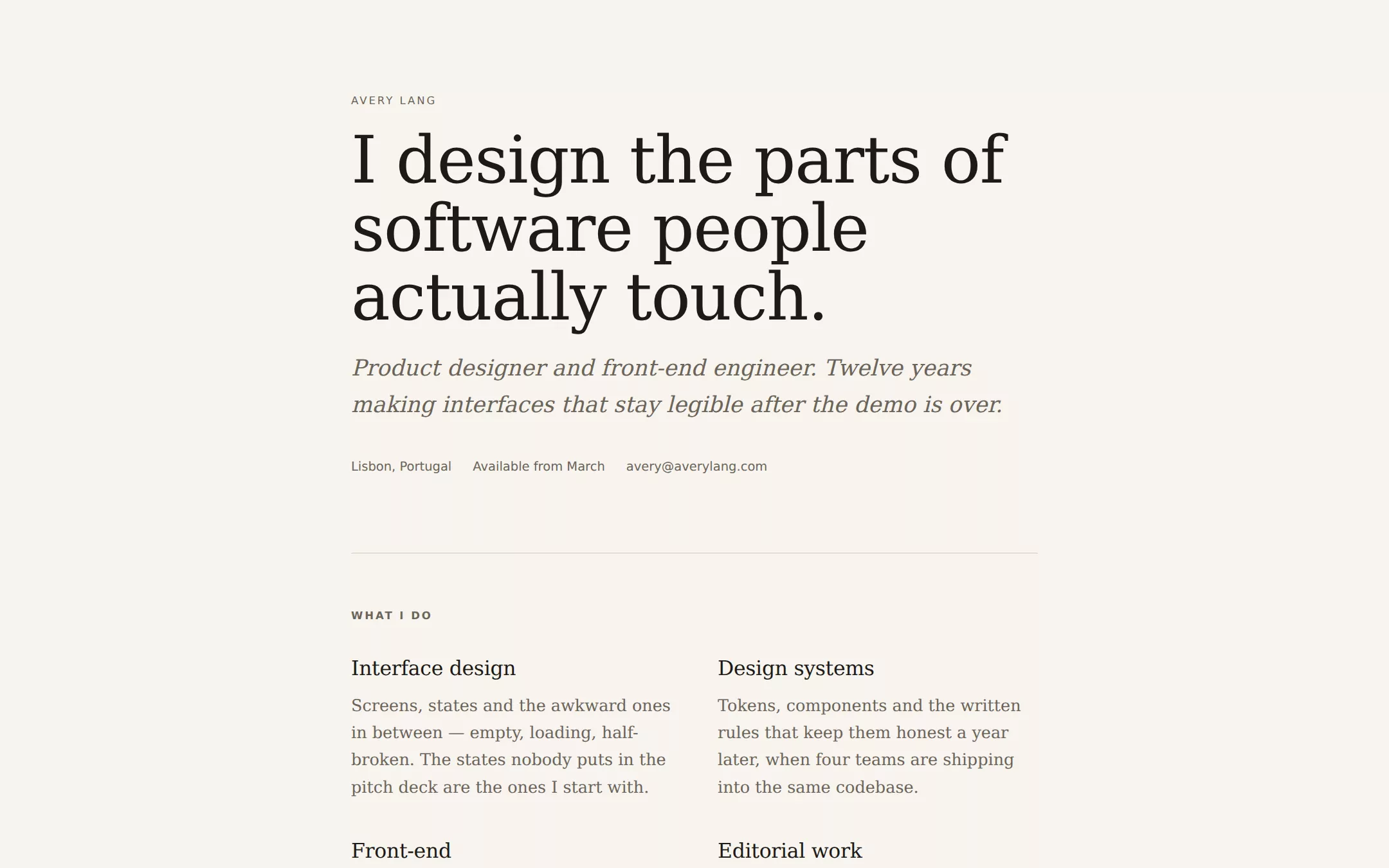
Warm paper, near-black ink and a single terracotta accent, set entirely in an old-style serif. Sections are separated by hairlines rather than cards, the lead paragraph is italic, and the about section opens on a drop cap. It reads like a page torn out of a magazine, which is exactly the point: nothing on it looks like a web template.
- Best for
- A designer, writer or editor who wants the page to read like a magazine masthead — quiet, typographic, and confident without a single decoration.
- Tech stack
- - Next.js (App Router) - React Server Components - TypeScript - Plain CSS with custom properties - Zero client-side JavaScript
- Tags
- editorial · serif · paper · quiet · about me
The creation prompt
830 words, self-contained. Paste it into a chat session with your coding agent and it builds Personal Resume (Light) end to end.
Build the "Personal Resume (Light)" kickstart — A printed contributor page, set in serif on warm paper..

## Design
Print, not web. Imagine the contributor page at the back of a well-made quarterly: generous margins, a single column no wider than 760px, and type doing all the work. Everything is warm — the background is a paper cream, never white, and the ink is a soft near-black rather than #000. There is exactly one colour on the page and it appears three times: the drop cap, the link underlines, and the one button. No cards, no shadows, no rounded corners beyond 2px, no icons. Hairlines separate sections and nothing else does.

### Colour palette (use these exact values)
- Background: #F7F4EE
- Surface / cards: #FFFDF8
- Primary text: #1C1A17
- Secondary text: #6B6459
- Accent (buttons, links, active state): #A44A2F
- Text on accent: #FFFDF8
- Borders / dividers: #DDD6C9
Use exactly one accent. Everything that needs emphasis earns it through weight, scale or space instead of a second colour.

### Typography
- Headings: Iowan Old Style, 'Palatino Linotype', Palatino, Georgia, 'Times New Roman', serif
- Body: Iowan Old Style, 'Palatino Linotype', Palatino, Georgia, 'Times New Roman', serif
- One serif does everything; a system sans appears only in 11px uppercase labels tracked to 0.18em. The h1 runs clamp(40px, 8vw, 68px) at weight 400 with -0.015em tracking — size carries the emphasis, never weight. Body sits at 18px/1.65.

### Page structure
1. Header: a small uppercase name label, then the h1 statement of what you do, an italic lead sentence, and a single row of plain facts (city, availability, email)
2. What I do: a two-column list of four practice areas, each a serif subhead over two sentences of muted body copy
3. Selected work: three or four projects as hairline-separated rows, each with the project name at 25px, a right-aligned year and role in small caps, and one paragraph of what actually changed
4. About: two or three paragraphs of first-person prose, the first opening on an accent-coloured drop cap
5. Get in touch: a short availability sentence, one accent button, and a fine-print line with the email, city and reply time

### Components and detailing
Buttons are a single solid accent rectangle at 2px radius, 14px sans label, 14px/26px padding — there is one on the page. Links are ink with a 1px accent underline that becomes accent on hover. Section labels are 11px uppercase sans at 0.18em tracking in the muted tone. Rules are 1px in the border colour, full column width, with 56px of section padding either side. The drop cap floats left at 64px with 0.82 line-height and 6px 10px 0 0 padding. No card, no fill, no shadow anywhere.

### Motion
Almost none, deliberately. Colour transitions on links and the button at 150ms ease, and nothing else moves — no reveal, no parallax, no counter. A page that reads like print should not animate; under prefers-reduced-motion even those transitions collapse to instant.

## Tech stack
- Next.js (App Router)
- React Server Components
- TypeScript
- Plain CSS with custom properties
- Zero client-side JavaScript
Where the repo you are working in already has an equivalent in place, keep the repo's choice and say which one you kept.

## Everything else
Build a personal “about me” one-pager on the latest Next.js (App Router).
Warm paper, near-black ink and a single terracotta accent, set entirely in an old-style serif. Sections are separated by hairlines rather than cards, the lead paragraph is italic, and the about section opens on a drop cap. It reads like a page torn out of a magazine, which is exactly the point: nothing on it looks like a web template.
Best for: A designer, writer or editor who wants the page to read like a magazine masthead — quiet, typographic, and confident without a single decoration.

### Copy and imagery
First person, past tense, specific. Every project line names what measurably changed rather than what was delivered — “support tickets about data entry fell by two thirds”, not “improved the data entry experience”. The about section earns its length by saying something true and slightly unexpected about how the person works. No photography and no logos: the type is the identity.

### Non-negotiables
- Responsive from 360px through desktop — no horizontal scrolling at any width.
- Every text/background pair clears WCAG AA (4.5:1 for body, 3:1 for large text); adjust a tint rather than shipping a failing pair.
- Fully keyboard operable, with a visible focus ring drawn in the accent colour.
- Honour `prefers-reduced-motion` — swap every transition for an instant state change.
- Write real copy in the voice described above; no lorem ipsum and no TODO placeholders.
- Use system or self-hosted fonts and CSS/SVG-drawn graphics — do not depend on a remote image or icon service.

Build the whole page end to end and show me the result running — not a description of it.
Pasting the prompt is step one. Fredrin runs the agent that builds it, one ticket per look.